![]() Table of Contents
Table of Contents
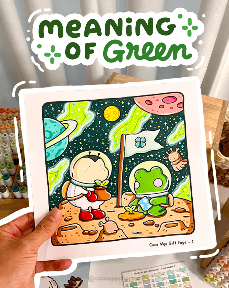
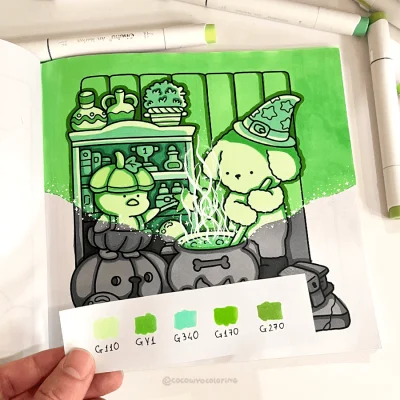
What Does The Color Green Mean?
Sometimes you look at a page and realize green is the one shade that instantly settles your mood. It feels steady, fresh, a little like stepping into open air.
That’s a big part of what the color green symbolize for many people, a quiet sense of ease that shows up the moment you see it.
What Does The Color Green Mean For Personality?
When green shows up in personality themes, it often points to someone who likes life to feel steady and clear. They’re usually the type who brings calm to conversations and notices the small things that keep people balanced.
Folks drawn to green often value emotional honesty, quiet confidence and a slow but steady approach to personal growth.
What Does The Color Green Mean In Marketing?
Green is one of those colors that instantly shifts how a brand feels the moment you see it. The meaning of the green color often leans toward freshness, balance and a natural sense of trust, which is why in marketing it’s used to create a calm, grounded mood.
Many brands rely on green to communicate wellness or eco friendly values, creating a calm and reliable impression. It’s a shade that helps audiences feel safe choosing the product.
Emerald Green Color Meaning
Emerald green feels like a deep breath of fresh air, rich steady calm wrapped in a bold natural glow. It’s often linked to growth, clarity, and a quiet kind of confidence that doesn’t need to shout.
It works beautifully in palettes that need a touch of lush energy or a grounded tone that makes every other color feel more alive.
Dark Green Color Meaning
Dark green feels like quiet strength, a steady shade that adds depth without pulling attention too hard. Many people connect it with stability, resilience and a grounded sense of focus.
It fits well in palettes that lean earthy or mature, bringing a calm steady presence that supports the colors around it.
Mint Green Color Meaning
Mint green brings a soft refreshing calm, almost like a cool breeze that lightens the whole mood. It’s often linked to clarity, gentleness, and a quiet sense of comfort.
Perfect for palettes that aim to feel airy and soothing, giving everything a clean bright lift without losing that mellow relaxed vibe.
Lime Green Color Meaning
Lime green carries this quick burst of energy, a shade that feels bright fresh and instantly uplifting. The color is often tied to creativity, curiosity, and a playful sense of openness.
Perfect for moments where you want a palette to feel lively and modern, adding a crisp spark that wakes everything up without becoming too intense.
Olive Green Color Meaning
Olive green carries a warm grounded calm, a shade that feels steady in a quiet almost earthy way. This color is often linked to wisdom, stability, and a thoughtful practical outlook.
A subtle depth comes through naturally in more muted or nature inspired palettes, creating a mature balanced tone without feeling heavy.
Sage Green Color Meaning
Sage green gives off a calm lived in softness, a muted tone that feels fresh soothing and effortlessly steady. This shade is often linked to a thoughtful organized mindset with a quiet kind of confidence.
Its gentle dusty look brings an easy relaxed mood to palettes that lean subtle comforting and slow paced.
Fun Facts About The Color Green
1. Green was hard to create historically
Back in medieval and Renaissance times, artists struggled to create a stable green pigment. Many versions faded fast or were made from verdigris, which could even damage paintings.
2. Human eyes detect green more easily
Our vision is naturally tuned to the green part of the spectrum, which is why this shade feels so gentle and easy to look at for long periods.
3. Ancient Egypt linked green with life and rebirth
Egyptians painted the god Osiris with green skin to symbolize renewal and the power of new life.
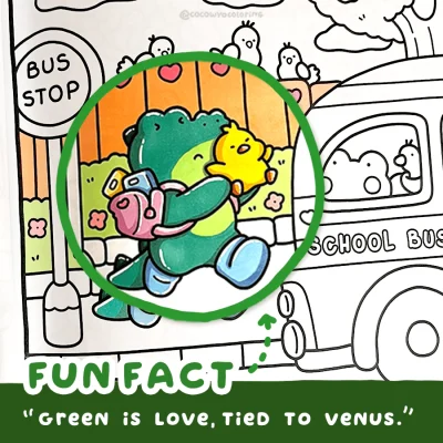
4. Green is the color of love, associated with Venus
In Roman tradition, Venus was linked to green for its ties to growth, harmony, and emotional warmth. The shade carried a quiet sense of renewal that fit the themes of love she represented.
5. US money turned green for a clever reason
In the 1800s, banks used green ink because it lasted longer and was harder to wash off, making counterfeiting more difficult. That’s how “greenbacks” got their name.
6. Plants look green because of chlorophyll
This pigment absorbs sunlight to help plants make energy. When chlorophyll fades in fall, the yellows and oranges underneath finally show.
7. Green once had an “unlucky” reputation in theater
Historic green dyes used arsenic compounds that could irritate skin or cause illness.
8. St. Patrick’s original color wasn’t green but blue
Early depictions show him wearing blue; green became popular later due to Ireland’s identity.
9. “Green rooms” were meant to calm nerves
Studios used muted green shades because they had a calming psychological effect.
10. Some minerals glow green under UV light
Fluorite, autunite, and others emit green fluorescence due to their crystal structure.
FAQs
Not at all. You only need a place to store the file. Once the PNG is downloaded, it stays on your device and you don’t need to log in again.
You can use them for quiet self-care moments, add them to your journal, print them as simple cards, color them on your iPad, or keep them handy for easy weekend activities with loved ones.
- Make a dedicated folder on your iPad or laptop so everything stays neat.
- Rename each file after you download it, so it’s easy to find later.
- Keep a backup in iCloud or Google Drive in case your device gets full or needs a reset.
- One simple idea: create a folder called “CocoWyo Freebies” to keep all your pages together in one cozy place.
Yes. Most printable sheets import smoothly into digital planners, including free printable Christmas coloring sheets. You can resize them, add stickers, and keep everything organized in your journal app.
Once saved, they’re yours. Our websites rotate their freebies seasonally, but your downloaded file won’t disappear from your device.
We don’t follow a strict schedule, but we usually add new freebies about twice a month. It’s always a good idea to check back now and then so you can grab the fresh ones as soon as they go up.
Most devices handle PNG coloring well. On iPhone, people often use Procreate, Goodnotes, or Adobe Fresco. On Android, apps like Ibis Paint X, Sketchbook and Medibang work smoothly. It really depends on what feels comfortable for you and how simple or detailed you like your coloring to be.