![]() Table of Contents
Table of Contents
When you think of Thanksgiving, what’s the first color that pops into your mind?
Maybe it’s the deep orange of a pumpkin pie, the golden glow of autumn leaves, or the rich red of cranberry sauce. Let’s walk through simple ways to create a palette perfect for cozy coloring sessions.
Classic Thanksgiving Color Palette Ideas
The most traditional color palette for thanksgiving are rooted in nature and family traditions. They bring a sense of nostalgia and warmth that feels like home, making them a timeless choice for crafts, décor, and coloring pages.
Pumpkin Pie Color
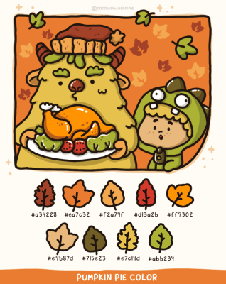
Warm Pumpkin Orange captures the glow of the harvest, bringing warmth and abundance to any Thanksgiving setting. At the heart of this palette is #DA5700 (Baked Pumpkin), supported by #581A01 (Rich Mocha), #742408 (Spiced Brown), #715E23 (Herbal Olive), and #FF9302 (Fresh Pumpkin) to keep the mood cozy and full of flavor.
Perfect for: building warm autumn palettes, highlighting cozy pumpkin tones in coloring pages, or creating rustic seasonal illustrations.
Chocolate Brown

Perfect for: adding depth to autumn palettes, grounding cozy Thanksgiving illustrations, and enriching coloring pages with warm, earthy tones.
Golden Yellows & Amber Tones

Like the glow of candlelight or an autumn sunset, golden yellows and amber tones bring warmth and coziness. The palette centers on Golden Yellow (#FFDF00) and Amber (#FFBF00), with touches of Gold (#FFD700), Yellow (#FFFF00), Freesia (#F6C324), Amber Yellow (#F8B845), and Mustard Yellow (#FFDB58).
Perfect for: creating radiant autumn palettes, adding golden highlights to coloring pages, or designing warm seasonal illustrations with a soft glow.
Cranberry
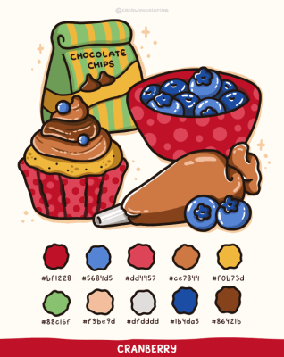
Cranberry red reflects warmth and celebration, adding contrast and liveliness. Alongside Burgundy (#9B121E), Crimson (#BF1228), Burnt Orange (#AC511C), Olive Green (#54671E) and Dark Brown (#69411E).
Perfect for: building bold autumn palettes, bringing festive reds into coloring pages, or adding vibrant contrast to seasonal illustrations.
Sage & Olive Greens
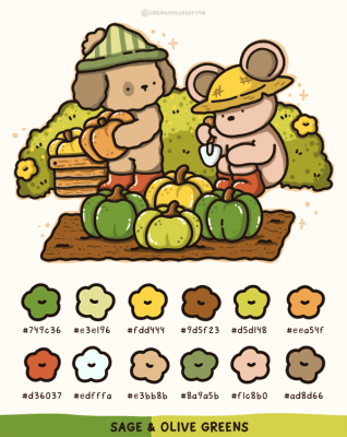
These earthy greens echo harvest vegetables and calm foliage. They balance the richness of oranges and reds, completing the natural Thanksgiving palette.
Main colors: Sage Green (#8A9A5B) and Olive Green (#BAB86C)
Perfect for: enriching autumn palettes with calm greens, blending earthy shades in coloring pages, or adding balance to seasonal illustrations.
Modern Thanksgiving Color Palettes for Coloring Pages
If you want to break away from the traditional orange-and-brown combo, these modern color palettes for Thanksgiving will bring a fresh twist to your coloring pages.
Pastel Autumn Shades

Use Pastel Orange (#FEB346), Brown (#633729), Ochre (#CB6E2D), Pearl (#EDE3C7), Sage (#BFB498), and Dark Pastel Red (#C03B22) to create a lighthearted palette with soft charm.
Perfect for: children’s coloring pages, cute animal scenes, or storybook-inspired settings.
Jewel Tones

If you love bold contrast and rich depth, go for Emerald Green (#2E8B57), Sapphire Blue (#1C4E80), and Amethyst Purple (#7C4DFF) with Gold (#FFD700) accents.
Perfect for: magical forests, nighttime Thanksgiving dinners, elegant décor accents, or sophisticated indoor scenes.
How to Create Your Own Thanksgiving Color Palette
The best part about Thanksgiving colors is how personal they can be. You don’t have to follow rules too strictly, just think of what makes you feel cozy, festive, then build your palette from there. Here’s a simple way to get started:
Step 1: Pick your hero color
This is your main mood setter. Think of the first picture that comes to mind when you imagine Thanksgiving, maybe a bright pumpkin, golden leaves or a rich tablecloth.
- Pumpkin Orange #D2691E (playful and bright)
- Wine Red #8B0000 (rich and grounding)
- Maple Gold #DAA520 (warm and celebratory)
Step 2: Add 2–3 supporting colors
These give your palette depth and story. If your hero color is Pumpkin Orange, try pairing it with:
- Earth Brown #8B4513 (wood, table)
- Autumn Gold #FFD700 (leaves, candles)
- Olive Green #556B2F (stems, napkins)
A simple rule to follow: one bold, one neutral, and one soft shade for balance.
Step 3: Balance warm and cool tones
Warm tones like orange, red, and yellow feel cozy, while cooler shades like green or slate grey bring calm.
Too many warm shades can feel heavy, so add a touch of cool to balance things out for example, Cool Slate (#708090) in dishes or background details.
Step 4: Test before you commit
Always swatch your palette first. Color a small shape, like a leaf, with all your chosen shades to see how they work together.
If something feels off, try a lighter or darker variation instead of scrapping the whole palette.
Step 5: Apply in sections
When you start your coloring page, work in stages background first, then the main subject, then smaller details. You can try this ratio:
- Hero color: 50%
- Supporting tones: 30–35%
- Accents: 15–20%
FAQs
Not at all. You only need a place to store the file. Once the PNG is downloaded, it stays on your device and you don’t need to log in again.
You can use them for quiet self-care moments, add them to your journal, print them as simple cards, color them on your iPad, or keep them handy for easy weekend activities with loved ones.
- Make a dedicated folder on your iPad or laptop so everything stays neat.
- Rename each file after you download it, so it’s easy to find later.
- Keep a backup in iCloud or Google Drive in case your device gets full or needs a reset.
- One simple idea: create a folder called “CocoWyo Freebies” to keep all your pages together in one cozy place.
Yes. Most printable sheets import smoothly into digital planners, including free printable Christmas coloring sheets. You can resize them, add stickers, and keep everything organized in your journal app.
Once saved, they’re yours. Our websites rotate their freebies seasonally, but your downloaded file won’t disappear from your device.
We don’t follow a strict schedule, but we usually add new freebies about twice a month. It’s always a good idea to check back now and then so you can grab the fresh ones as soon as they go up.
Most devices handle PNG coloring well. On iPhone, people often use Procreate, Goodnotes, or Adobe Fresco. On Android, apps like Ibis Paint X, Sketchbook and Medibang work smoothly. It really depends on what feels comfortable for you and how simple or detailed you like your coloring to be.